\n
\n\n
\n\n
\n\n
\n\n\n \n
\n\n
\n\n\n
\n\n
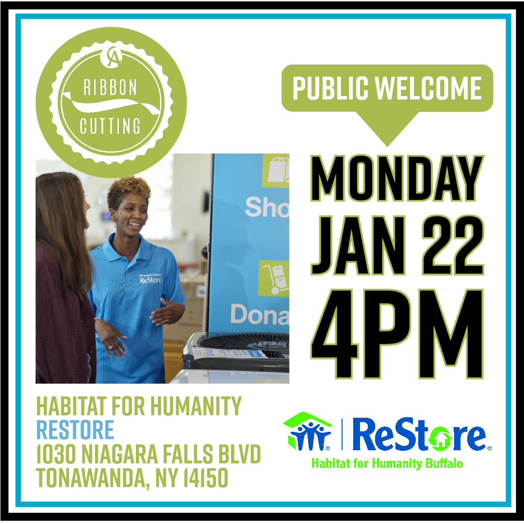
\nHabitat Buffalo&rsquo\;s ReStore is a socially-conscious retail outlet\, selling gently-used furniture\, household appliances\, building materials\, and home accessories. ReStore inventory changes daily\, and items are sold at a fraction of retail price. Thousands of items are kept out of landfills\, and every purchase helps Habitat build homes for families in need.
\n\n
\n\n
\n\n
\n\n\n
\n\n
\n\n
\n\n \n
\n
\n\n
\n\n
\n\n
\n\n
\n\n\n
\n\n
\n \;
\n\n\n
\n\n\n
\n\n
\n\n
\nNew items arrive daily! Stop into either of our locations.
\n